We are thrilled to announce an exciting new collaboration between Decorex and the internationally recognised English designer, Bethan Laura Wood. Discover the unique pattern that has been created and how this creative partnership came about.
We are thrilled to announce an exciting new collaboration between Decorex and the internationally recognised English designer, Bethan Laura Wood. Bethan is known for her multidisciplinary practice, which is characterised by material investigation, unique texture and a passion for vibrant colour and detail. Bethan took on the challenge of reimagining Decorex’s creative for 2022 and after several sessions with the Decorex team produced a dazzling abstract pattern.
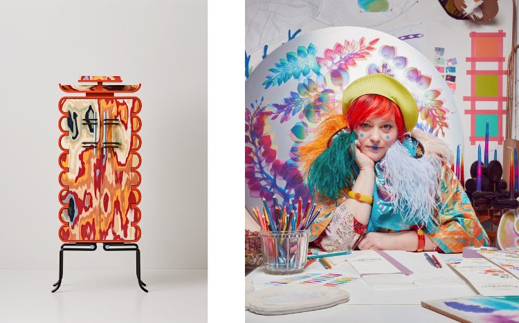
Meisen Tall Cabinet - 2021 | Bethan Laura Wood
Bethan Laura Wood: Life & Work
Bethan Laura Wood has owned her studio since 2009, her passion for colour and detail is renowned amongst the art and design community. Often working in response to her location, Bethan is also fascinated by the connections we make with the everyday objects that surround us.
Bethan obtained an MA in Design Products at the Royal College of Art, under the tuition of Jurgen Bey and Martino Gamper. Since 2011 she has worked with the prestigious Nilufar Gallery to showcase her limited edition, one-off works. Over the years, her work has been exhibited in institutions across the globe including: Victoria and Albert Museum; Swiss Institute New York; Daelim Museum, Seoul; Museum of Contemporary Art, MOT, Tokyo; ICA London and the Design Museum London.
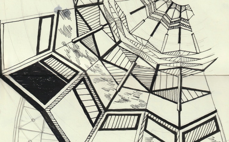
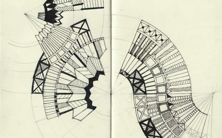
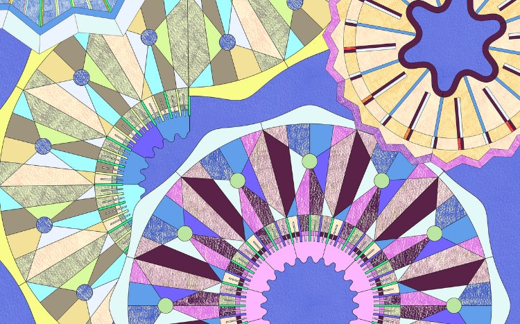
Bethan Laura Wood's Initial Sketches
Throughout her career Bethan has sought to share her knowledge and unique style with the next generation of creatives. That is why she has dedicated time to delivering lectures and teaching workshops at many well-known universities in the UK such as RCA, ECAL and Central Saint Martins College of Art and Design. Meanwhile, Bethan has appeared as a guest speaker at many international fairs around the world, from Tokyo to Toronto.
Above all, Bethan is praised for her highly individual designs and extraordinary approach to making. Her work stands out for its minute detail and mind-blowing complexity, along with being inventive in nature.
Taking Inspiration From Olympia London's Architecture
The Inspiration Behind the Design
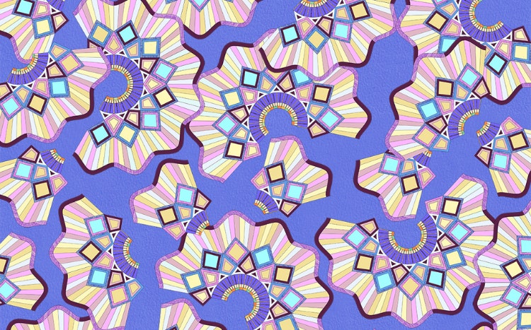
Bethan started her creative journey with a trip to Olympia London, the event’s venue, where she was immediately dazzled by the intricate detailing in the roof of the exhibition hall. The iron structures caught her attention, this felt like a great place to start her initial sketches. Bethan found inspiration in aspects of its architectural structure, translating small details from the roof archways within the design. She used criss-crossed patterns, strong lines and swirling shapes to create a preliminary idea.
Exclusive Design by Bethan Laura Wood
She also built upon some of her own previous work, which used repeating fan-like shapes to create an overall impression of movement. This resonated with the Decorex team, reminding them of pencil sharpenings. This was a path Bethan and Decorex felt they wishes to pursue. It was agreed that these 'sharpenings' successfully represented the initial process of creation within the interior design field. As the majority of designs – whether they be of a new product collection or a room design – often start with a simple sketch and gradually develop from there.
Then the colours were selected, which was a particularly enjoyable aspect of the process. Bethan noticed the stunning pink, purple and blue hues that emblazoned the sky as the sun gradually set through the windows of Olympia London during her visit. These hues were incorporated into the colour palette, but dialled up in vibrancy to give the overall design a fun energy.
Texture was another important aspect woven into Bethan's design. The final pattern is interspersed with block colours and shaded segments with a crayon-like effect, which mingle together playfully to make a cohesive form.
Decorex X Bethan Laura Wood
Bethan’s Design at Decorex 2022
Look out for the new creative from Bethan Laura Wood across our website and social media. You can also expect to see the design in all its glory at our in-person event taking place from 9-12 October.
Find out what you can expect from 2022’s event and why you simply can’t miss the upcoming edition.
We hope that you have enjoyed reading this article, you may also like:
Our Partners


