Decorex International is part of the Informa Markets Division of Informa PLC
This site is operated by a business or businesses owned by Informa PLC and all copyright resides with them. Informa PLC's registered office is 5 Howick Place, London SW1P 1WG. Registered in England and Wales. Number 8860726.
Decorex’s Autumn Colour Report 2020
Decorex explores the colours that have been most prevalent and important to the design world in the months leading up to autumn, and how these might be woven into our decorating schemes going forward. With reference to Dulux’s 2021 Colour of the Year and input from some of the experts, we discuss the part colour might have to play as 2020 slowly draws to a close.
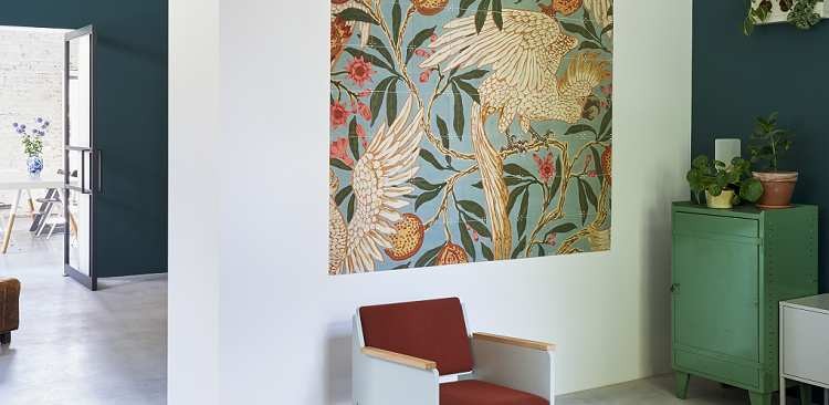 V&A COCKATOO AND POMEGRANATE WALLPAPER
Earthy tones
One of the most recent colour leanings for 2020 are earthy tones. Not long ago, Dulux announced their Colour of the Year 2021 was ‘Brave Ground’, a reassuring earthy brown with a deep finish. With an almost elemental feel, the colour sets a neutral tone to the areas of the home it is applied to. After months of working with paint company AkzoNobel and a roster of trend forecasters, design specialists, editors and architects from across the globe, Dulux finally decided on the shade. The colour selection was largely influenced by the coronavirus outbreak that has been experienced worldwide, referencing the resilience of everyday people and the reflective place that many have found themselves in.
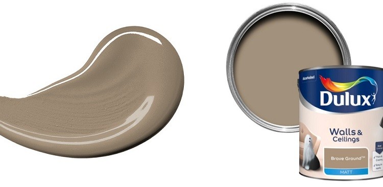 DULUX BRAVE GROUND
Talking more on the decision to select Brave Ground as the colour of 2021, they stated: “Dulux colour experts have chosen Brave Ground™, a bolstering shade that connects back to nature and the simple things. A warm, earthy tone, it creates a feeling of stability, growth and potential; and provides a firm foundation for change and creativity in your home.”
Other colours in this category proving popular are stone grey, subtle creams and dusty beiges. All of these tones manage to bring a sense of calm into a space. These can easily be mixed with more playful tones and patterns brought in via carpets, rugs and upholstery.
In an article by Elle Decoration, Jade Joyner of Metal + Petal stated: “I love warm creams and lovely stone colours—colours that leave me feeling grounded. […] I love washing an entire room in the same colour and finish with a linen or stone. I expect to see a lot of these natural, earthy tones for the remainder of 2020.”
 TOYINE SELLERS: EARTHY COLOURED PILLOW COLLECTION
Warming hues
As we transition into autumn and enjoy the last lingering days of sunshine, many of us would like nothing more than to see a warm palette used within our interiors. It therefore comes as no surprise that rich terracotta, umber and sun-baked orange are creeping into the most stylish home arrangements.
These colours have the knack of combining the happy feeling of summer, with the cosy and sumptuous feeling that we crave in the colder months – creating a trans-seasonal effect. Such colour displays work well with an eclectic mixture of patterns and textures. Try combining with paisleys and intricate Indian block prints.
 ALDECO: FABRICS IN TERRACOTTA TONES
Marika Meyer of Meyer Interiors is one such designer welcoming a warmer colour palette into her layouts: “Say goodbye to the cool tones that have ruled for so many years. Shades of chocolate brown, wine, olive green, and ochre are all taking over in homes. We love substituting these warm, natural colours for a neutral on the sofa or walls.”
Joyner was another design professional to be rejoicing in warm hues, she admitted that “I’ve also found myself leaning into terra-cotta tones.”
The wonderful thing about this tendency for sun-drenched colour combinations is that they feel very timeless and can easily be updated with new accessories and fabrics. Much like the earthy tones that are seeing a resurgence, there is a natural feel to this colour group.
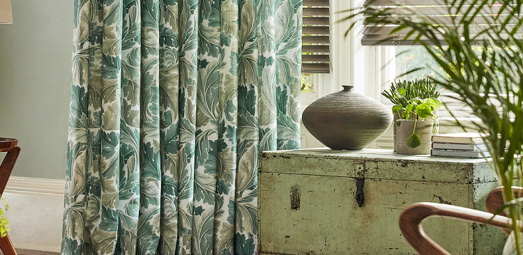 V&A: BLINDS 2 GO MORRIS ACANTHUS
Shades of nature
It seems that the stresses of the outside world have pushed us to seek solace in shades that have a calming effect, ones that reflect the beauty of nature in all its glory.
Take note of this palette that explores a spectrum of flora and fauna with green tones for every mood – from airy, moss green to dark and mysterious Amazon green.
In general, green is known for its ability to create a soothing atmosphere – a much needed use of colour for many of us. While green is often recognised as a cool colour, it can be livened with warmer touches to create balance within a room. This versatile colour can be worked in matte tones on crafted ceramics or alternatively with a semi-shine velvet on upholstery and cushions to amplify the sense of opulence. Dulux’s unique shade ‘Cultivate’ is an ideal example of a tonal green that makes us feel nurtured and empowered.
Other natural tones can also be harnessed to this effect including stone greys and dark blues; colours that reflect the sky at night. Use these in a space where you’d like to feel safe and relaxed – a spot to unwind after a long day.
Biophilia is a term often used to describe human beings’ innate and genetically determined affinity with the natural world. While this term can be used quite flippantly within the design sphere – usually when prompting people to add more plants into their interior schemes – being mindful of its influence can be hugely beneficial to the outcome of a design project.
Choosing an array of colours that reflect a certain natural habitat can have a very powerful effect on those inhabiting that space. It is important, however, to get the balance right and use colour, texture and interior accessories in a synchronistic way. Decorex Virtual will be hosting a talk on this topic, during our November event, called Back To Nature is the Future The virtual discussion will take a deeper look into the power that colour has on human behaviour and how we can harness our connection to nature to create a seamless aesthetic at home. Speakers include Karen Haller – Colour and Design Consultancy, Nicola Keenan – Co-Founder of Boxx Creative and Olga Turner – Co-Founder of Ekkist.
If you enjoyed reading Decorex’s Autumn Colour Report 2020, you might like the following:
Copyright © 2024. All rights reserved. Informa Markets, a trading division of Informa PLC.